popmon: code breakfast session
Good morning, and welcome to the code breakfast session. This notebook will guide you through ⭐ popmon, an open-source tool built by colleagues at ING that helps monitor population stability of your data.
You will see that popmon is also useful for quickly exploring new datasets with a time component. Moreover, you will learn the ins and outs of motivations and how the package is built up.
You can move through the notebook at your own pace. If you feel the pace is to high or you have would like to explore another dataset or feature of popmon, go ahead! Additional tutorials are available here. To keep things interesting, there is a mix of minimal math, code and explanations. Feel free to skip parts. The notebook starts with a chunk of theory, after which you will work on an exercise (choice out of two). The exercises start at section 5 and 6 of the notebook. You can find FAQ and Resources at the end of the notebook.
Let’s get started to learn, and wishing you the most of fun while doing so!
Table of contents
- Table of contents
- Getting started
- Dataset shift for Supervised Learning
- popmon’s concepts and architecture
- Understanding popmon reports
- Exercise: physical traffic in a digital world
- Bonus Exercise: monitoring text data (advanced)
- Final remarks
- FAQ
- Resources
Getting started
The following command will install popmon via pip in your notebook environment:
import sys
!{sys.executable} -m pip install -q popmon
Dataset shift for Supervised Learning
We start with introducing the concepts that popmon builds upon and share experience from profiling datasets.
When people develop machine learning models, they typically focus on optimizing certain metrics in a cross-validation setup to maximize the generalization and thus minimize the loss or generalization error. In this session we will focus on this scenario:
Supervised learning: The goal of supervised learning is to infer an underlying input–output relation based on input–output samples. Once the underlying relation can be successfully learned, output values for unseen input points can be predicted. Thus, the learning machine can generalize to unexperienced situations. Studies of supervised learning are aimed at letting the learning machine acquire the best generalization performance from a small number of training samples. The supervised learning problem can be formulated as a function approximation problem from samples. 5
If the model moves to production, then a new challenge begins: make sure the model stay performant. This is not a given:
Classically, learning always assumes that the underlying probability distribution of the data from which inference is made stays the same. In other words, it is understood that there is no change in distribution between the sample from which we learn to and the novel (unseen) out-of-sample data. In many practical settings this assumption is incorrect, and thus standard prediction will likely be suboptimal.5
Changing distributions are also referred to as non-stationary. In the context of train/test validation, one can define dataset shift as: the joint probability of a dataset differs between training and testing stages.
Formally, assume we have a set of independent variables (features) \(X \in \mathbb{R}^{M \times N}\) and a dependent variable \(y = { y_i \in {0, 1} \mid 0 < i < N }\)
Let \(X_{\text{train}}\) be the training set and \(X_{\text{test}}\) be the test set, where \(X_{\text{train}} \in X\) and \((X_{\text{test}} \in X\) and \(X_{\text{train}} \cap X_{\text{test}} = \emptyset\).
Note that we simplify here to continuous features for binary classification with a setup with a single train/test split.
The dataset shift is then: \(p(X_{train}, Y_{train}) \neq p(X_{test}, Y_{test})\) 6
Provided Bayes theorem:
\[p(Y\vert X) = \frac{p(X\vert Y) \cdot p(Y)}{p(X)}\]We can observe that a prediction for the class label \(Y\) given \(X\) (i.e. \(p(Y \vert X)\) ) depends on three components.
Fun history fact:
The general result (…) is always called ‘Bayes’ theorem’, although Bayes never wrote it; and it is really nothing but the product rule of probability theory which had been recognized by others, such as James Bernoulli and A. de Moivre (1718), long before the work of Bayes. Furthermore, it was not Bayes but Laplace (1774) who first saw the result in generality and showed how to use it in real problems of inference. 4
Form of dataset shift
From Bayes theorem we can deduce that there are multiple places where this can break. These subtypes of dataset shift are referred to by their own name. The following types of dataset shift can be distinguished:
- Covariate shift: Shift in independent variables (\(p(x)\)).
- Prior probability shift: shift in the target variable (the class, \(p(y)\)).
- Concept shift: Shift in the relationship between the independent and target variable. (i.e. \(p(x \vert y)\) )
⚠️ Warning: there appears to be a lack of standard terms around dataset shifts! Other terms meaning essentially the same: “Changing environments” and “Fractures between data”. 7
The term dataset shift was first used in this book (2008)9:
More examples are available in 10.
Covariate shift
Covariate shift is a shift in independent variables (\(p(x)\)). This is also known as “covariate drift”, “population shift”, “change in data distributions” or “test data is outside of data manifold trained on”.

To get some intuition on covariate shift, we start with an exampled (modified from 8). This example demonstrates how new incoming data can invalidate the current model.
import numpy as np
import matplotlib.pyplot as plt
As a first step, generate data where there is only a shift in independent variables. This can be clearly observed from the fact that the same function to obtain y from x (i.e. \(p(y \vertx)\) is used.
def y_cond_x(x):
    """
    p(y|x)
    -----------------
    y = x^2 + 10r - 5
    r = uniform(0, 1)
    """
    y = x**2 + 10 * np.random.random(x.shape[0]) - 5
    return y


n_samples_X_test = 1000
x = 11 * np.random.random(n_samples_X_test)- 6.0
y = y_cond_x(x)
X_test = np.c_[x, y]

n_samples_X_train = 100
x = 7 * np.random.random(n_samples_X_train) - 6.0
y = y_cond_x(x)
X_train = np.c_[x, y]
Next, we plot the data: the green data is the training set (emphasized by bigger data point size), the blue data is the (covariance shifted) test dataset. You can comment out the plotting of the test data if you would like to see what the train data looks like in isolation.
plt.figure(figsize=(10,6))
plt.scatter(X_test[:,0], X_test[:,1], marker='o', s=4, c='b', label='test data')
plt.scatter(X_train[:,0], X_train[:,1], marker='o', s=30, c='g', label='train data')
plt.xlabel('feature value')
plt.ylabel('target value')
plt.legend()
plt.show()
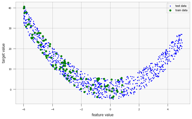
Looking at the training data only, we assume the model is a second-degree polynomial (which will be later confirmed by the test data).
If the data generation was slightly more covariate shifted (e.g. replace 7 * np.random by 3 * np.random), then we might even assume that the model was linear.
(You can try that scenario by uncommenting the last line.)
from sklearn.preprocessing import PolynomialFeatures
from sklearn.linear_model import LinearRegression
from sklearn.pipeline import Pipeline


def polyfit(data, degree=2):
    """
    Fit a polynomial with `degree`
    Degree 2: a * x^2 + b* x + c
    """
    model = Pipeline([('poly', PolynomialFeatures(degree=degree)), ('linear', LinearRegression(fit_intercept=False))])
    model = model.fit(data[:, 0].reshape(-1, 1), data[:, 1])
    curve = np.array(list(reversed(model.named_steps['linear'].coef_)))
    return curve


# Polynomial fit
curve1 = polyfit(X_test, degree=2)
curve2 = polyfit(X_train, degree=2)

# Linear fit
# curve2 = polyfit(X_train, degree=1)
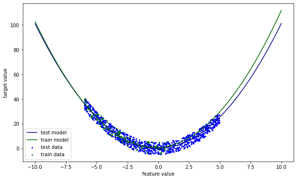
The model a high error on the right side, where the input feature value is high. In other words, the model does not extrapolate well. The next section discusses how this could be resolved.
x = np.linspace(-10, 10,100)
y1 = np.polyval(curve1, x)
y2 = np.polyval(curve2, x)

plt.figure(figsize=(10,6))
plt.scatter(X_test[:,0], X_test[:,1], marker='o', s=4, c='b', label='test data')
plt.scatter(X_train[:,0], X_train[:,1], marker='o', s=4, c='g', label='train data')
plt.plot(x,y1, c='darkblue', label='test model')
plt.plot(x,y2, c='darkgreen', label='train model')
plt.xlabel('feature value')
plt.ylabel('target value')
plt.legend()
plt.show()
How can we identify covariate shift? Put differently, how can we say that \(p(X_{train}) \neq p(X_{test})\)? We saw before that visual inspection is an option. For larger scale monitoring, hypothesis testing could offer outcome.
When a covariate shift is identified, there are multiple ways to mitigate. The model could abstain from prediction, or the model could be updated. The next example illustrates the reasoning behind abstaining from prediction. A KNeighborsClassifier is trained to discriminate between three classes, generated from a trimodal bivariate gaussian. In the figure below you can see that the model is confident, even in areas where no data was observed (i.e. outside the data manifold \(p(x)\)). Alternatively, it outputs high confidence scores when extrapolating.
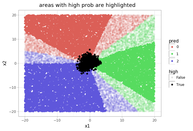
In this example, \(p(x)\) has been modelled by a Gaussian mixture model (GaussianMixture(3)). Now both models can be combined. Points too far outside this GMM, recall which only has seen \(X_{train}\), will receive a lower confidence score. The succeeding image shows the result.
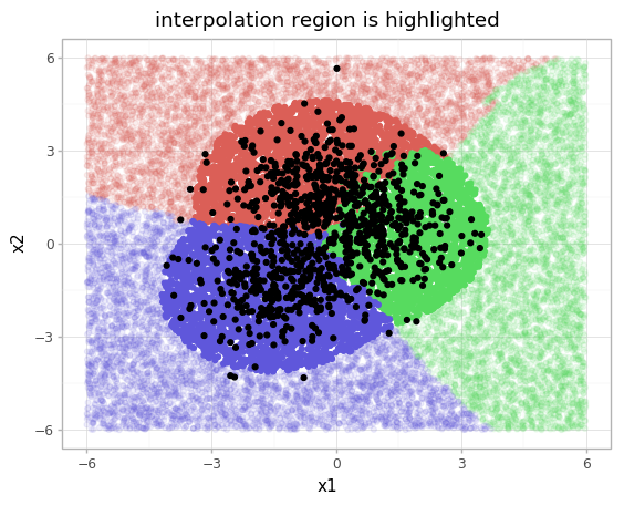
You can find a more elaborate description of this example, together with the code, at the original blog. Note that modelling \(p(X)\) can be tricky and would not be as straight-forward as in this toy example, however the abstaining approach is effective.
Numerous algorithms exist for covariate shift adaptation (also known as domain adaptation). For the test set, no labels are available. One approach is to reweight the training data and increase the weights of the training samples that are closest to the test sample. More sophisticated algorithms can be found in 5.
More on the identification will be discussed after we’ve gone through the forms of dataset shift.
Another place where you may have encountered mitigating of the covariate shift, is in batch normalization.
Prior probability shift
Prior probability shift is the shift in the target variable (the class, \(p(y)\)).
For a binary classification problem, a prior probability shift takes place when the ratio of positively labelled examples in the train set signifcantly differs from the test set.
A model that is designed on a fraud dataset where the class balance \(p(y_{train})\) (the number of fraud cases vs non-fraud cases) is 1%, will probably not perform well on a test set with equal probabilities. The prior probability shift is a common issue in simple generative models, such as Naive Bayes. 9
If \(p(y_{test})\) is known, then correcting for the shift is possible by changing this term of the generative model. For new incoming data we often do not have this information, although we can choose to annotate (samples of) the incoming data to obtain it. When \(p(y_{test})\) is unknown, it should be estimated. Given the learned model \(p(x\vert y)\) and \(p(x_{test})\), certain values are more likely than others.
A real-world example where estimation of \(p(y)\) is required can be found in Snorkel (See A.3.5 of this paper).
Concept shift
Concept shift is the shift in the relationship between the independent and target variable (i.e. \(p(x\vert y)\))
Many examples could be given. Interesting work has been done on analyzing the change of word meanings over time using word embeddings. If X is the word ‘Amazon’ and Y is ‘CO2 production’ then the relation starts changing somewhere after 1994.
Closer to home: the label ‘fraud’ is often used as an umbrella term for myriad schemes. Once one scheme can be controlled effectively, likely new schemes are discovered.
And obviously the pandemic has changed our lives, where changes as working from home and government support also change relations in the real world that are baked into certain models (e.g. bankruptcy detection).
The way to deal with this data rot, model rot or model decay, is by retraining on recent data. Tools as Seldon, Alibi, Mlflow and Kubeflow may help to monitor the model for concept shifts.
Profiling
To identify and mitigate dataset shift, we would like to check if the distributions are the same. But how? A data profile is a collection of statistics computed. This can be used to inspect the dataset, and is frequently used for the task of Exploratory Data Analysis (EDA).
There are tools that compute many statistics upfront and present the data profile to the user. Popular examples are:
- ⭐ pandas-profiling 2. (8k stars, 25M downloads, > 10k users in industry, including FAANG, and many researchers in academia)
- AWS Deequ
- Great Expectations
Can tracking of certain descriptive statistics such as mean, min, max and std be used to monitor covariate shift?
Yes, but not always. These statistics provide some information on the covariates in a dataset, but do not necessarily paint a complete picture. A counter example to the thesis is provided in the next section.Monitoring descriptive statistics
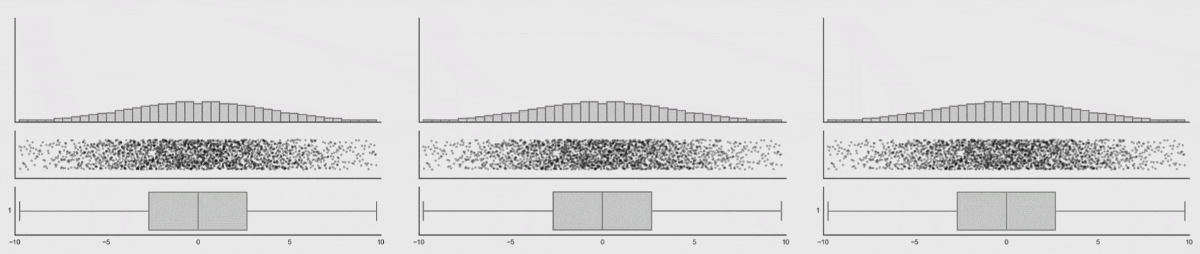
The figures below are taken from interesting work from Autodesk researchers in 2017. 3 It showcases how it is possible to generate visually dissimilar datasets, that have the same values for a fixed set of statistics (in this case mean, std and correlation between variables). The authors propose a technique based on simulated annealing to move random points towards a particular shape.
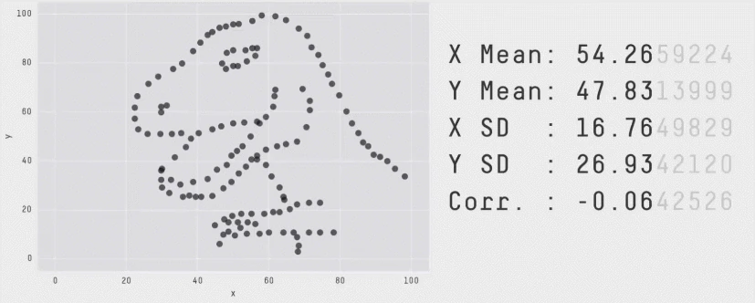
The next image shows that even though the dataset changes, and the histograms changes, the data profile remains constant. From the visualization we can see that tracking the box-plot statistics alone would not show the dataset shift, but tracking the histogram would in this case.
popmon’s concepts and architecture
We developed popmon for the lack of a good open-source solution to monitor the data going in (features) and out (predictions) our models more carefully. It was designed to run reliably in production to make sure that new incoming data is consistent with training data. Another factor was that we have past experience doing effectively (Max Baak @ CERN).
In the previous section we discussed dataset shift and profiling. Now, we should have all background needed to understand what popmon is doing. This section covers core concepts. Read this page in the docs if you feel like you would like more background later on.
Histograms
Histograms can be used for monitoring datasets as we saw earlier. The high-level procedure for generating histograms is simple. For continuous data: bin the data based on intervals, count the frequency for each bin. For categorical data: count each value. The histogram can be normalized to obtain a probability per bin.
Doing histogramming right requires dealing with many special cases. Histogrammar generates the histograms for us and takes care of specific edge cases (e.g. sparse histograms).
Additional reasons to use the histogram representation:
- Efficient: the representation is small, and can be used to compute metrics fast (weighted mean for instance);
- Privacy: aggregating the data provides some level of privacy;
- Scale: the approach can be invariant to dataset size.
References
The data to monitor is split in time-slices (or batches). The histograms for the time-slices can be compared to a reference. popmon provides the following references:
- self-reference: use the full dataset and compare slices of it to itself (useful for for EDA)
- external reference: compare to a provided dataset (e.g. a training set, \(p(x)\))
- rolling reference: a sliding windowed dataset to compare to (fresh data)
- expanding reference: increase the reference dataset size when new data comes in (when initially little data is available)
Statistical comparisons
How are the reference and the time-slice compared? Using a bunch of statistical tests. They take the role of the aforementioned hypothesis tests. A selection of the comparisons included by default:
- Pearson’s correlation
- Chi squared
- Kolmogorov Smirnoff
- Trend detection (LR)
Users can choose to add custom comparison function \(f: \text{histogram}_1 \times \text{histogram}_2 \rightarrow \mathbb{R}\). Some tests are more sensitive than others, making them suitable for certain data and use cases. (Customization is touched upon in the FAQ on the bottom of this notebook)
Profiles
Examples of statistics computed by popmon:
- Count
- Mean
- Std/Var
- Percentiles (median)
- MAD
The statistics depend on user settings and on the type of the variable (categorical, ordinal, continuous). Here customization is also possible: the user can choose to extend the default set of statistics.
(Would you like to learn more on data types? ⭐ visions is the type system we’ve developed for pandas-profiling 2.)
Alerting
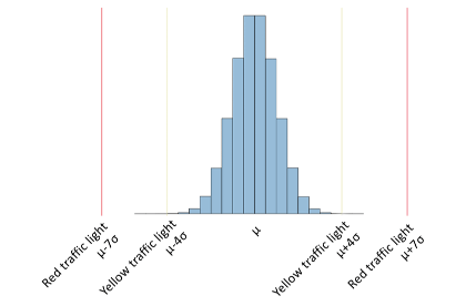
popmon alerts when extreme values are observed. Alerting is based on the Z-score (also known as pull in Physics).
\[Z = \frac{X - \mathbb{E}[X]}{\sigma(X)}\]For each data point of interest - this can be any of the comparisons or profiles - the pull is computed:
\[\underbrace{Z}_\text{outlier score} = \frac{\underbrace{X}_\text{data point} - \underbrace{\mathbb{E}[X]}_\text{reference dataset mean}}{\underbrace{\sigma(X)}_\text{reference dataset std}}\]The bounds at which to alert are configurable, e.g. \(Z > 4\) are set for warning and \(Z > 7\) for error.
Reports
The aforementioned concepts are reported in a HTML report. Reports are an effective way to present the abundance of diagrams and statistics to the user in a structured manner. An additional benefit is that it generates an audit trail for the validation that is crucial in our regulated environment.
The minimum code to generate a report based on a pandas DataFrame:
# import popmon
# df.pm_stability_report(time_axis=True).to_file("report.html")
Pipelines and Data Store
Note: this topic is advanced, feel free to skip or come back later.
Popmon was designed consisting of modules in pipelines. Each module takes its input from and stores its output into the datastore. The datastore is a hashmap/dictionary containing a value for each key.
Pipelines and modules empower users to modify the standard workflow and fit it to solve their problem, in their environment, under their restrictions. The structure also makes that we can visualize the data pipelines in popmon easily (akin to kedro):
- popmon-report-pipeline-subgraphs-unversioned.pdf
- popmon-report-pipeline-subgraphs-versioned.pdf
- popmon-report-pipeline-unversioned.pdf
- popmon-report-pipeline-versioned.pdf
(The difference between those four visualisations is (1) do we group subpipelines yes/no and (2) do we append a version number to datastore values when they are overwritten yes/no)
Understanding popmon reports
There are multiple strategies of going through popmon reports, depending on your task at hand. For instance, when exploring a dataset you might be interested in the volumes (counts) in each time slice and the presence of features. This indicates that you would start at the end of the report: inspecting individual profiles.
When monitoring the input of a trained model then you’ve already identified features that should be monitored. The traffic lights section would be the place to start. The red alerts indicate the comparisons to check first.
There is a dedicated notebook on how to read the diagrams here.
Exercise: physical traffic in a digital world
The exercise starts with one of my favourite dataset: the RDW’s vehicle registration dataset. The dataset’s description is:
All non-sensitive data from the Dutch vehicle fleet.
Your task is to investigate this dataset and look for interesting patterns using popmon, in other words, perform Exploratory Data Analysis (EDA).
Special interest goes out to how the data changes over time. Are there new categories added? What about the volume over years? Questions are added to provide inspiration for exploration ideas.

The full dataset contains 14,4 Million rows and 67 columns 1 and is licenced under the Creative Commons 0 (CC0). Unfortunately, the Socrata platform that RDW is using only offers inefficient data formats for download (e.g. CSV) which for this data takes up over 10 GB. Converting the data to Parquet reduced its file size to 805 MB. A huge improvement, but still overkill for this tutorial.
Tip: ⭐ compressio can help you get more amazing automated size reductions 2.
To get you started, we’ve prepared a 100k sample from the full dataset to get you started. Since we’re only exploring, this is fine. The sample is available with this notebook here (5.77 MB).

import pandas as pd
df = pd.read_parquet("./data/rdw_sample_100k.parquet")
A note on the dataset’s language. The dataset is in Dutch. With the existence of automated translation software this shouldn’t be a problem for non-native speakers.
As great data scientists you will be able to overcome this problem. Did you know that the research group behind LSTM won Farsi, Arabic and Chinese handwriting recognition challenges (ICDAR 2009,2011) despite not having any native speakers in their team? 11
We’ve added a utility script to translate the column names nonetheless. Some columns (e.g. Vehicle Type) will still contain Dutch entries.
# Utitlity to translate the column names
def rdw_cols_nl2en(columns):
    """Replace Dutch column names with English translations"""
    column_names_nl = ['Kenteken', 'Voertuigsoort', 'Merk', 'Handelsbenaming',
       'Vervaldatum APK', 'Datum tenaamstelling', 'Bruto BPM', 'Inrichting',
       'Aantal zitplaatsen', 'Eerste kleur', 'Tweede kleur',
       'Aantal cilinders', 'Cilinderinhoud', 'Massa ledig voertuig',
       'Toegestane maximum massa voertuig', 'Massa rijklaar',
       'Maximum massa trekken ongeremd', 'Maximum trekken massa geremd',
       'Zuinigheidslabel', 'Datum eerste toelating',
       'Datum eerste afgifte Nederland', 'Wacht op keuren', 'Catalogusprijs',
       'WAM verzekerd', 'Maximale constructiesnelheid (brom/snorfiets)',
       'Laadvermogen', 'Oplegger geremd', 'Aanhangwagen autonoom geremd',
       'Aanhangwagen middenas geremd', 'Vermogen (brom/snorfiets)',
       'Aantal staanplaatsen', 'Aantal deuren', 'Aantal wielen',
       'Afstand hart koppeling tot achterzijde voertuig',
       'Afstand voorzijde voertuig tot hart koppeling',
       'Afwijkende maximum snelheid', 'Lengte', 'Breedte',
       'Europese voertuigcategorie', 'Europese voertuigcategorie toevoeging',
       'Europese uitvoeringcategorie toevoeging', 'Plaats chassisnummer',
       'Technische max. massa voertuig', 'Type', 'Type gasinstallatie',
       'Typegoedkeuringsnummer', 'Variant', 'Uitvoering',
       'Volgnummer wijziging EU typegoedkeuring', 'Vermogen massarijklaar',
       'Wielbasis', 'Export indicator', 'Openstaande terugroepactie indicator',
       'Vervaldatum tachograaf', 'Taxi indicator',
       'Maximum massa samenstelling', 'Aantal rolstoelplaatsen',
       'Maximum ondersteunende snelheid', 'API Gekentekende_voertuigen_assen',
       'API Gekentekende_voertuigen_brandstof',
       'API Gekentekende_voertuigen_carrosserie',
       'API Gekentekende_voertuigen_carrosserie_specifiek',
       'API Gekentekende_voertuigen_voertuigklasse']

    column_names_en = ['Registration number', 'Vehicle type', 'Make', 'Trade name',
       'Expiry date of MOT', 'Date of registration', 'Gross BPM', 'Fixture',
       'Number of seats', 'First colour', 'Second colour',
       'Number of cylinders', 'Cylinder capacity', 'Unladen vehicle mass',
       'Maximum permissible vehicle mass', 'Mass in running order',
       'Maximum towing mass unbraked', 'Maximum towing mass braked',
       'Economy label', 'Date of first registration',
       'Date of first issue in the Netherlands', 'Awaiting inspection', 'List price',
       'WAM insured', 'Maximum design speed (moped/scooter)',
       'Load capacity', 'Semi-trailer braked', 'Autonomous trailer braked',
       'Trailer centre axle braked', 'Power (moped/scooter)',
       'Number of standees', 'Number of doors', 'Number of wheels',
       'Distance from centre of coupling to rear of vehicle',
       'Distance from front of vehicle to centre of coupling',
       'deviation from maximum speed', 'Length', 'Width',
       'European vehicle category', 'European vehicle category addition',
       'European implementation category addition', 'Chassis number location',
       'Technical maximum vehicle mass', 'Type', 'Type of gas installation',
       'Type approval number', 'Variant', 'Version',
       'EU type-approval amendment number', 'Power output in running order',
       'Wheelbase', 'Export indicator', 'Outstanding recall indicator',
       'Tachograph expiry date', 'Taxi indicator',
       'Maximum mass composition', 'Number of wheelchair spaces',
       'Maximum supporting speed', 'API Signed_vehicles_axles',
       'API Licensed_vehicles_fuel',
       'API licensed_vehicles_coach',
       'API licensed_vehicles_coach_specific',
       'API licensed_vehicles_class']
    mapping = dict(zip(column_names_nl, column_names_en))
    return list(map(mapping.get, columns))

df.columns = rdw_cols_nl2en(df.columns)
There are multiple date columns in the dataset, let’s preprocess them:
date_columns = ['Expiry date of MOT', 'Date of registration', 'Date of first registration', 'Date of first issue in the Netherlands', 'Tachograph expiry date']
df[date_columns] = df[date_columns].apply(pd.to_datetime, format="%Y%m%d", errors='coerce')
df[date_columns]
| Expiry date of MOT | Date of registration | Date of first registration | Date of first issue in the Netherlands | Tachograph expiry date | |
|---|---|---|---|---|---|
| 0 | 2022-11-28 | 2017-10-27 | 2014-11-28 | 2014-11-28 | NaT |
| 1 | 2021-12-19 | 2013-10-21 | 2011-12-19 | 2011-12-19 | NaT |
| 2 | 2022-04-02 | 2017-10-24 | 2017-10-20 | 2017-10-20 | 2021-09-16 |
| 3 | 2022-11-27 | 2019-12-06 | 2017-02-06 | 2017-02-06 | NaT |
| 4 | 2021-11-28 | 2019-12-05 | 2009-06-30 | 2009-06-30 | NaT |
| ... | ... | ... | ... | ... | ... |
| 99995 | 2021-12-27 | 2016-12-28 | 2005-12-02 | 2005-12-02 | NaT |
| 99996 | 2021-07-24 | 2009-07-24 | 2009-07-24 | 2009-07-24 | NaT |
| 99997 | 2021-12-10 | 2018-02-22 | 2010-12-10 | 2010-12-10 | NaT |
| 99998 | 2021-11-28 | 2019-02-09 | 2012-11-28 | 2012-11-28 | NaT |
| 99999 | 2021-12-21 | 2018-01-23 | 2008-01-10 | 2008-01-10 | NaT |
100000 rows × 5 columns
You will need to select a time-axis. This minima may be needed later.
df[date_columns].min()
Expiry date of MOT                       1988-05-30
Date of registration                     1980-09-17
Date of first registration               1922-06-30
Date of first issue in the Netherlands   1952-08-01
Tachograph expiry date                   1996-11-15
dtype: datetime64[ns]
Other columns range from car make, colour, taxi indicator to API link.
In case you would like some background on the semantics:
df.columns
Index(['Registration number', 'Vehicle type', 'Make', 'Trade name',
       'Expiry date of MOT', 'Date of registration', 'Gross BPM', 'Fixture',
       'Number of seats', 'First colour', 'Second colour',
       'Number of cylinders', 'Cylinder capacity', 'Unladen vehicle mass',
       'Maximum permissible vehicle mass', 'Mass in running order',
       'Maximum towing mass unbraked', 'Maximum towing mass braked',
       'Economy label', 'Date of first registration',
       'Date of first issue in the Netherlands', 'Awaiting inspection',
       'List price', 'WAM insured', 'Maximum design speed (moped/scooter)',
       'Load capacity', 'Semi-trailer braked', 'Autonomous trailer braked',
       'Trailer centre axle braked', 'Power (moped/scooter)',
       'Number of standees', 'Number of doors', 'Number of wheels',
       'Distance from centre of coupling to rear of vehicle',
       'Distance from front of vehicle to centre of coupling',
       'deviation from maximum speed', 'Length', 'Width',
       'European vehicle category', 'European vehicle category addition',
       'European implementation category addition', 'Chassis number location',
       'Technical maximum vehicle mass', 'Type', 'Type of gas installation',
       'Type approval number', 'Variant', 'Version',
       'EU type-approval amendment number', 'Power output in running order',
       'Wheelbase', 'Export indicator', 'Outstanding recall indicator',
       'Tachograph expiry date', 'Taxi indicator', 'Maximum mass composition',
       'Number of wheelchair spaces', 'Maximum supporting speed',
       'API Signed_vehicles_axles', 'API Licensed_vehicles_fuel',
       'API licensed_vehicles_coach', 'API licensed_vehicles_coach_specific',
       'API licensed_vehicles_class'],
      dtype='object')
df
| Registration number | Vehicle type | Make | Trade name | Expiry date of MOT | Date of registration | Gross BPM | Fixture | Number of seats | First colour | ... | Tachograph expiry date | Taxi indicator | Maximum mass composition | Number of wheelchair spaces | Maximum supporting speed | API Signed_vehicles_axles | API Licensed_vehicles_fuel | API licensed_vehicles_coach | API licensed_vehicles_coach_specific | API licensed_vehicles_class | |
|---|---|---|---|---|---|---|---|---|---|---|---|---|---|---|---|---|---|---|---|---|---|
| 0 | 4XZJ91 | Personenauto | CITROEN | CITROEN C1 | 2022-11-28 | 2017-10-27 | NaN | hatchback | 4.0 | BLAUW | ... | NaT | Nee | 1240.0 | 0.0 | 0.0 | https://opendata.rdw.nl/resource/3huj-srit.json | https://opendata.rdw.nl/resource/8ys7-d773.json | https://opendata.rdw.nl/resource/vezc-m2t6.json | https://opendata.rdw.nl/resource/jhie-znh9.json | https://opendata.rdw.nl/resource/kmfi-hrps.json |
| 1 | 50SVK3 | Personenauto | KIA | RIO | 2021-12-19 | 2013-10-21 | NaN | MPV | 5.0 | BEIGE | ... | NaT | Nee | 2460.0 | 0.0 | 0.0 | https://opendata.rdw.nl/resource/3huj-srit.json | https://opendata.rdw.nl/resource/8ys7-d773.json | https://opendata.rdw.nl/resource/vezc-m2t6.json | https://opendata.rdw.nl/resource/jhie-znh9.json | https://opendata.rdw.nl/resource/kmfi-hrps.json |
| 2 | 81BKB5 | Bedrijfsauto | DAF | LF 210 FA | 2022-04-02 | 2017-10-24 | NaN | gesloten opbouw | 2.0 | N.v.t. | ... | 2021-09-16 | Nee | NaN | NaN | NaN | https://opendata.rdw.nl/resource/3huj-srit.json | https://opendata.rdw.nl/resource/8ys7-d773.json | https://opendata.rdw.nl/resource/vezc-m2t6.json | https://opendata.rdw.nl/resource/jhie-znh9.json | https://opendata.rdw.nl/resource/kmfi-hrps.json |
| 3 | NJ125B | Personenauto | OPEL | KARL / VIVA | 2022-11-27 | 2019-12-06 | 1693.0 | hatchback | 5.0 | WIT | ... | NaT | Nee | 0.0 | 0.0 | 0.0 | https://opendata.rdw.nl/resource/3huj-srit.json | https://opendata.rdw.nl/resource/8ys7-d773.json | https://opendata.rdw.nl/resource/vezc-m2t6.json | https://opendata.rdw.nl/resource/jhie-znh9.json | https://opendata.rdw.nl/resource/kmfi-hrps.json |
| 4 | 54JLF4 | Personenauto | RENAULT | MEGANE SCENIC | 2021-11-28 | 2019-12-05 | 5976.0 | MPV | 5.0 | BEIGE | ... | NaT | Nee | 2950.0 | 0.0 | NaN | https://opendata.rdw.nl/resource/3huj-srit.json | https://opendata.rdw.nl/resource/8ys7-d773.json | https://opendata.rdw.nl/resource/vezc-m2t6.json | https://opendata.rdw.nl/resource/jhie-znh9.json | https://opendata.rdw.nl/resource/kmfi-hrps.json |
| ... | ... | ... | ... | ... | ... | ... | ... | ... | ... | ... | ... | ... | ... | ... | ... | ... | ... | ... | ... | ... | ... |
| 99995 | 62SFKN | Personenauto | VOLVO | S60 | 2021-12-27 | 2016-12-28 | 9240.0 | sedan | 5.0 | BLAUW | ... | NaT | Nee | 3580.0 | 0.0 | NaN | https://opendata.rdw.nl/resource/3huj-srit.json | https://opendata.rdw.nl/resource/8ys7-d773.json | https://opendata.rdw.nl/resource/vezc-m2t6.json | https://opendata.rdw.nl/resource/jhie-znh9.json | https://opendata.rdw.nl/resource/kmfi-hrps.json |
| 99996 | 2VDP28 | Bedrijfsauto | VOLKSWAGEN | CADDY MAXI 77 KW BESTEL 1,9 TDI | 2021-07-24 | 2009-07-24 | 7408.0 | gesloten opbouw | 2.0 | N.v.t. | ... | NaT | Nee | 3650.0 | NaN | NaN | https://opendata.rdw.nl/resource/3huj-srit.json | https://opendata.rdw.nl/resource/8ys7-d773.json | https://opendata.rdw.nl/resource/vezc-m2t6.json | https://opendata.rdw.nl/resource/jhie-znh9.json | https://opendata.rdw.nl/resource/kmfi-hrps.json |
| 99997 | 68NXG5 | Personenauto | PEUGEOT | 308 | 2021-12-10 | 2018-02-22 | 4838.0 | MPV | 7.0 | GRIJS | ... | NaT | Nee | 3300.0 | 0.0 | NaN | https://opendata.rdw.nl/resource/3huj-srit.json | https://opendata.rdw.nl/resource/8ys7-d773.json | https://opendata.rdw.nl/resource/vezc-m2t6.json | https://opendata.rdw.nl/resource/jhie-znh9.json | https://opendata.rdw.nl/resource/kmfi-hrps.json |
| 99998 | 44ZJD9 | Personenauto | SUZUKI | ALTO | 2021-11-28 | 2019-02-09 | NaN | hatchback | 4.0 | GRIJS | ... | NaT | Nee | 1450.0 | 0.0 | 0.0 | https://opendata.rdw.nl/resource/3huj-srit.json | https://opendata.rdw.nl/resource/8ys7-d773.json | https://opendata.rdw.nl/resource/vezc-m2t6.json | https://opendata.rdw.nl/resource/jhie-znh9.json | https://opendata.rdw.nl/resource/kmfi-hrps.json |
| 99999 | 99ZFFR | Personenauto | PEUGEOT | 207 | 2021-12-21 | 2018-01-23 | 4935.0 | stationwagen | 5.0 | GRIJS | ... | NaT | Nee | 2605.0 | 0.0 | 0.0 | https://opendata.rdw.nl/resource/3huj-srit.json | https://opendata.rdw.nl/resource/8ys7-d773.json | https://opendata.rdw.nl/resource/vezc-m2t6.json | https://opendata.rdw.nl/resource/jhie-znh9.json | https://opendata.rdw.nl/resource/kmfi-hrps.json |
100000 rows × 63 columns
import popmon
There is API documentation available here in case you would like to learn more. Uncomment the cell below the see the function signature and docstring. Questions are available a couple of cells down. You can alter the code below and regenerate the report.
# pd.DataFrame.pm_stability_report?
report_ = df.pm_stability_report(
    time_axis="your time axis here",
    time_width="52w",
    features=[
        "Vehicle type",
        "Make",
        "Fixture",
        "Gross BPM",
        "List price",
        "First colour",
        "Second colour"
        # more features here
    ],
Some questions that you might want to explore:
Question: How does a time_width of '1y' differ from '52w'? Does it matter?
Yes, it matters. pd.Timedelta('1Y').value * 1.15740741 * 10**-14 = 365.24, while 52 * 7 = 364.
This discrepancy has an effect on, among other things, seasonality. The same holds for a '1M' (month) vs using a number of days (28-31).
Question: we can in the report that the histograms are not exactly years, but starting randomly in the dataset. How can you change the monitoring to start on this first of January?
Set thetime_offset parameter. We start on 01-01 of the minimum year.
`df['Datum tennaamstelling'].min()`
Question: Looking at "count" statistic under profiles, how is are the volumes changing over time?
There appears to be an exponential growth in the dataset.Question: Which car Make was most recorded in 1987 and 1989? And what was the most popular make last year?
Same approach as before.Question: How is the average listing price developing over time? And what about the min/max?
Use the same procedure as before.Question: What can we learn from the histogram of "Second colour" about the preprocessing of this column? How can we clean it?
A: The "n.v.t", Dutch for Not applicable, could be replaced with NaN/None to improve reproting.Question: popmon is able compute 2D histograms to monitor interactions. Try adding an interaction between "List price" and "Gross BPM"
Add a feature"Gross BPM:List price" (you might need to prefix the feature with [time_axis column]:.
Code Hint
report_ = df.pm_stability_report(
    time_axis="Date of registration",
    time_width="52w",
    # Start the first day of the year
    time_offset="01-01-1980",
    features=[
        "Date of registration:Vehicle type",
        "Date of registration:Make",
        "Date of registration:Fixture",
        "Date of registration:Gross BPM",
        "Date of registration:List price",
        # Interaction term
        "Date of registration:Gross BPM:List price",
        "Date of registration:First colour",
        "Date of registration:Second colour"
    ],
)
report_
The comparison values are less useful in the current EDA (sorted on “Date of Registration”), as the volume increases exponentially. Let’s change the setup slightly and split the data into 5 equally-size batches randomly.
# quick and dirty split in five random subsets
mask = np.random.rand(len(df))
batch1 = mask <= 0.2
batch2 = (0.2 < mask) & (mask <= 0.4)
batch3 = (0.4 < mask) & (mask <= 0.6)
batch4 = (0.6 < mask) & (mask <= 0.8)
batch5 = 0.8 < mask
shuffle_split =  df.copy()
shuffle_split.loc[batch1, "batch_id"] = 1
shuffle_split.loc[batch2, "batch_id"] = 2
shuffle_split.loc[batch3, "batch_id"] = 3
shuffle_split.loc[batch4, "batch_id"] = 4
shuffle_split.loc[batch5, "batch_id"] = 5
shuffle_split['batch_id'] = shuffle_split['batch_id'].astype(np.int8)
import popmon
Question: by default the two last histograms are displayed, change this to display all 5.
Add the parameterplot_hist_n=5,
report_ = shuffle_split.pm_stability_report(
    time_axis="batch_id",
    time_width=1,
    features=[
        "Vehicle type",
        "Make",
        "Fixture",
        "Gross BPM",
        "List price",
        "First colour",
        "Second colour",
    ],
)
report_
Bonus Exercise: monitoring text data (advanced)
In this exercise you will be challenged to explore strategies to monitor a dataset with textual columns.
The challenges in dealing with text data is that the raw text is considered a categorical variable with high cardinality. This hides information on similarity between two strings. Vectorization, replacing the string with a vector representing the text, is a proven technique. This ranges from classical TF-IDF, to state-of-the-art sentence embeddings.
The challenge in this exercise is uncover patterns in the free text data of the dataset with respect to Unicode Properties.
Unicode Properties
Python by default ships with a version of Unicode Character Database (Python 3.6 has UCD 9.0, 3.7 has UCD 11.0.0, 3.8 has 12.0.1, 3.9 has 13.0.0).
The UCD is available in the standard library unicodedata.
Note that Python 3 added unicode support, but that this is different from the UCD. Unicode support handles storing and manipulating unicode characters, while this package aims to provide properties of specific characters.
This standard library allows us to lookup certain properties of a Unicode character such as name and category. For “$” this would be “Dollar Sign” and “Sc”. The mapping for categories (“Sc” means “Currency_Symbol”) is not included by default, neither are other useful properties such as block (“ASCII”) and script (“Common”).
These properties are extremely useful when monitoring data for unexpected characters.
Luckily ⭐ tangled-up-in-unicode 2 comes to the rescue as a drop-in replacement for unicodedata with (1) a fixed version of UCD regardless of python version and (2) a complete range of properties.
import sys
!{sys.executable} -m pip install tangled-up-in-unicode
You can choose any dataset with free text to do this exercise. For demonstration purposed, we use a randomly chosen category of the Amazon Reviews Dataset: Pet Supplies.
For the same reasons as in the previous exercise, we use a subset of the data. The dataset is available for download here (1,11 GB uncompressed).
import pandas as pd
import gzip
import json
def parse(path):
    g = gzip.open(path, 'rb')
    for l in g:
        yield json.loads(l)
def getDF(path):
    df = {
        i: d
        for i, d in enumerate(parse(path))
    }
    return pd.DataFrame.from_dict(df, orient='index')
path = './data/Pet_Supplies_5.json.gz'
df = getDF(path)
df = df.sort_values('unixReviewTime')
df.drop(columns=['style', 'image'], inplace=True)
df['review_time'] = pd.to_datetime(df['unixReviewTime'], unit='s')
df
from tangled_up_in_unicode import category_long# , category
from collections import Counter, defaultdict
from unicodedata import category
category_long(category('a'))
def cat(x):
    c = category(x)
    if not c:
        return None
    return category_long(c)
def sum_cats(d):
    cat_counts = defaultdict(int)
    for k, v in d.items():
        cat_counts[category(k)] += v
    return cat_counts
df['reviewText_vc'] = df['reviewText'].apply(lambda x: Counter(list(str(x))))
df['reviewText_cat'] = df['reviewText_vc'].apply(sum_cats)
category_df = pd.json_normalize(df['reviewText_cat'])
category_df = category_df.fillna(0).astype(np.int16)
category_df.columns = [category_long(c) for c in category_df.columns]
category_df.index = df.index
category_df
df = pd.concat([df, category_df], axis=1)
df
import popmon
report_ = df.pm_stability_report(
    time_axis="review_time",
    time_width="52w",
    features=["review_time:overall"] + [f"review_time:{c}" for c in category_df.columns]
)
report_
Final remarks
In this code breakfast session we’ve learned about dataset shift. Terminology is not standardized, however often we can trace a variants back to one of three of covariance shift, prior probability shift or concept shift. The core concepts behind popmon were discussed and hopefully you enjoyed working on one or two of the exercises.
Feedback is very much welcome via Slack (#popmon or personal), via the Github repository or per email at simon.brugman@ing.com. Are interested in contributing to popmon’s development? Then the popmon core development team is more than happy to help you onboard (See FAQ for more info).
Have a great continuation of your amazing day!
FAQ
Beginner
I'm running into an error and exhausted my options, what to do next?
You can reach out via the #popmon channel on Slack or contact us via the Github repository. Chances are others are running into the same error, so no need to be shy in sharing.I'd like to use popmon in my daily work, where can I find resources?
The package and documentation are available on Github. There is also the #popmon channel on Slack where you can reach out with questions.How can I monitor feature interactions?
popmon can monitor 2D histograms (such as pairwise features).
Simply pass the features separated by colons to the features parameter, e.g.:
features=["[time_axis]:[feature 1]:[feature 2]"].
Intermediate
My dataset does not have a date(time) column, can I still use popmon?
In many cases, the answer is 'Yes'. The minimum you need to use popmon is an incremental ID column to indicate batches. When doing online analysis, where batches of data come in, you can still use popmon when a batch ID is assigned. The tutorials section has instructions on how to work with incremental dataset.Advanced
How do I add a custom metric? (e.g. PSI?)
In case the current metrics do not cover your needs, you can change the pipeline to include a custom metric. To do so, define your metric as a function to two histograms (see the existing comparissons for examples). Note that you might reuse part of other functions as they could be related (e.g. PSI to Gtest) Currently, the metrics needs to be added to thestats_functions parameter of the HistProfiler step in your pipeline.
If you would like guidance to adding a custom metric to popmon, then creating an issue at the Github repository will help you out.
How do I customize reports?
The reports generated by popmon are fully customizable. It depends on which aspects which concrete steps you should take and how much effort if would be. The pipeline controls metrics that are computed, the comparisons, and the sections that are generated and their order. Have a look at the existing implementations to get started. If you would like to change the appearance of the report, then you can overwrite the matplotlib styling or HTML templates. For help, please reach out on the #popmon channel or create an issue on the Github page.With what tools can popmon integrate?
popmon works out-of-the-box with pandas and (py)spark, and can integrate easily beyond that. As long as the input is either a dataset or precomputed histograms, then popmon can generate the profiles, comparissons and (dynamic) alerts and output that as either HTML report or give the datastore right back. The HTML report can be integrated, as Amundsen does in DAP. The datastore can be written into a database or filesystem and used to integrate with other applications (e.g. Great Expectations, Grafana)How can I contribute to the GitHub package?
If you already have a specific feature in mind, feel free to send in a Pull Request to the Github repository. In case you would like to discuss upfront, then creating an issue at the Github repository will be the best next step. If you're looking for inspiration, we have a backlog with items, ranging from beginner to advanced and varying in skillset (statistics, data engineering, performance optimization, vizualisation, etc.). You can reach us via the #popmon channel on Slack with question.Resources
- Footnote 1: https://opendata.rdw.nl/Voertuigen/Open-Data-RDW-Gekentekende_voertuigen/m9d7-ebf2
- Footnote 2: Self-promotion disclaimer. Created by the same author as the notebook you are looking at now. ⭐ Starring the repository on Github is very much appreciated.
- Footnote 3: https://www.autodesk.com/research/publications/same-stats-different-graphs
- Footnote 4: E.T. Jaynes, Probability Theory: The Logic of Science
- Footnote 5: Machine Learning in Non-Stationary Environments (2012)
- Footnote 6: Moreno-Torres, J. G., Raeder, T., Alaiz-Rodríguez, R., Chawla, N. V., & Herrera, F. (2012). A unifying view on dataset shift in classification. Pattern recognition, 45(1), 521-530.
- Footnote 7: http://iwann.ugr.es/2011/pdf/InvitedTalk-FHerrera-IWANN11.pdf
- Footnote 8: based on this notebook
- Footnote 9 : Quiñonero-Candela, J., Sugiyama, M., Lawrence, N. D., & Schwaighofer, A. (Eds.). (2009). Dataset shift in machine learning. Mit Press.
- Footnote 10: More examples on dataset shift (summarized from 9).
- Footnote 11: https://people.idsia.ch/~juergen/